Case Study — Law Firm Branding & Web
Ross Harper
Logo redesign and website mockups for Ross Harper — a Glasgow law firm — introducing a distinctive pillar logo and turquoise primary colour to differentiate the brand while maintaining professional credibility.
Role
Web & Brand Designer
Client
Ross Harper Law
Stack
Adobe XD · Illustrator · Custom CMS
Services
Logo Design · Web Design · Branding
Project Gallery
Overview
About the project
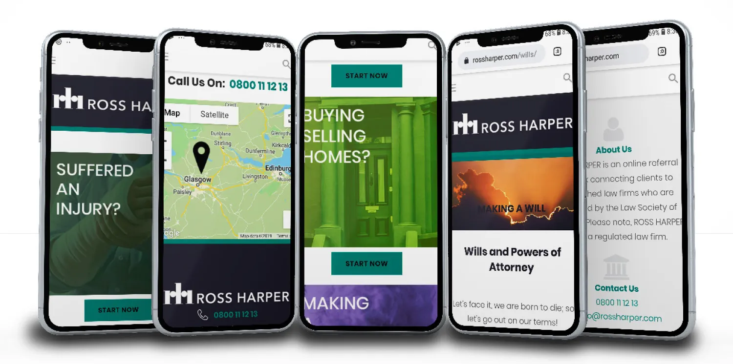
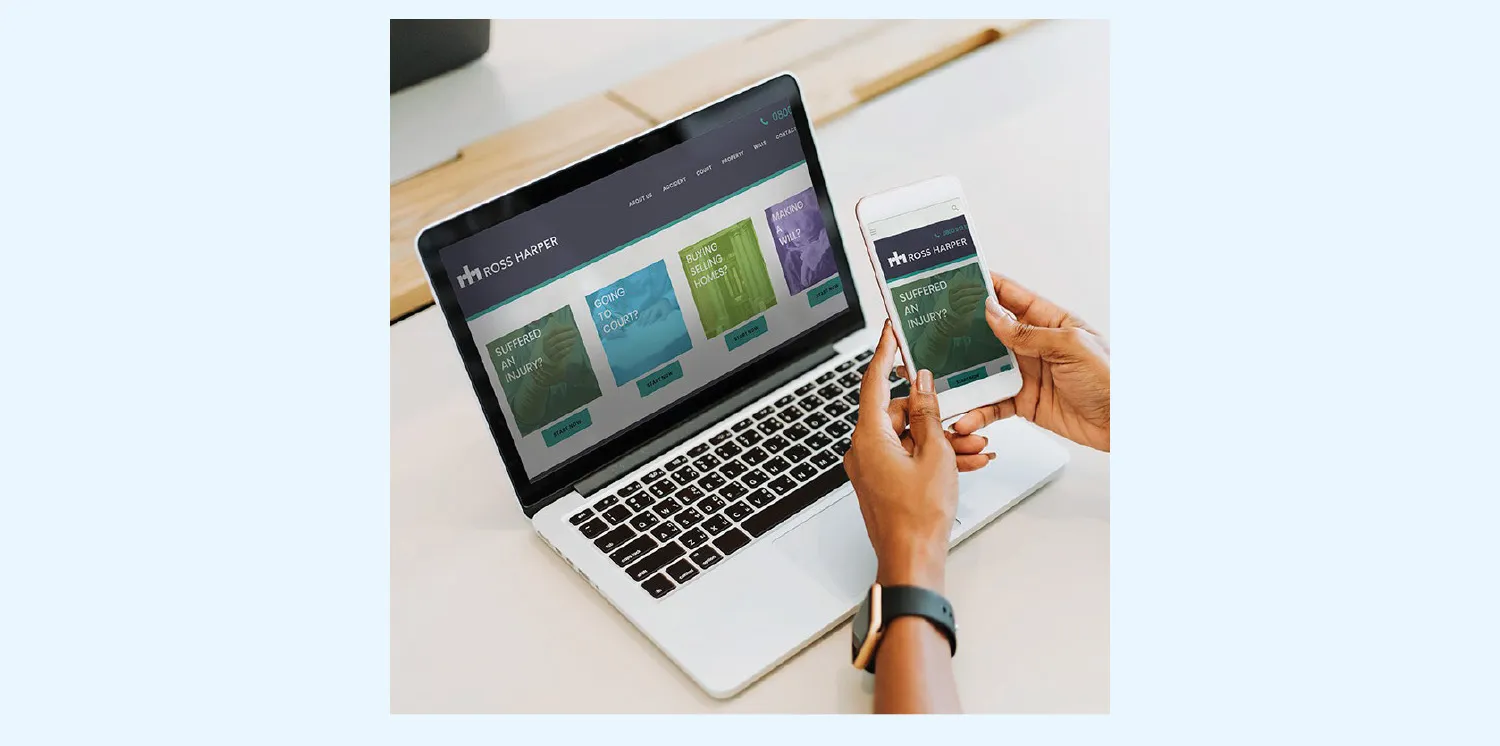
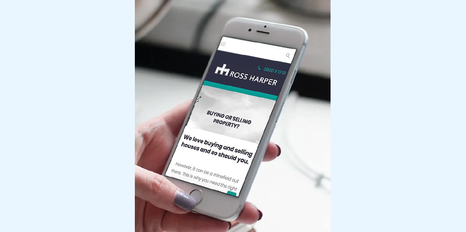
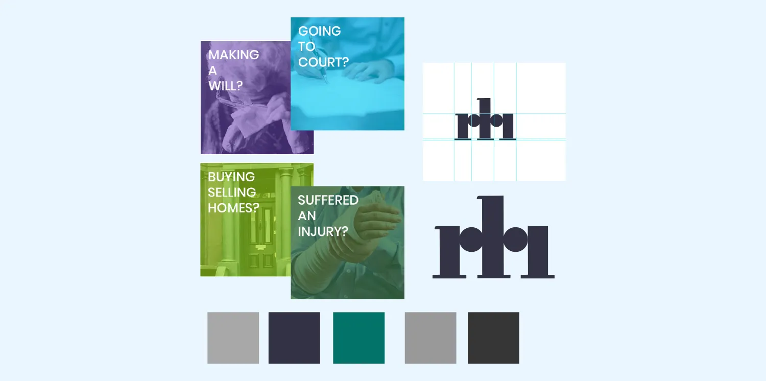
Ross Harper is a Glasgow law firm. Working as part of a small design team, the project focused on logo redesign and website mockups to differentiate the firm from typical solicitor websites. The new logo uses pillar shapes to represent the company initials — evoking both the firm’s name and legal authority. A turquoise primary colour replaced the original palette, injecting contemporary energy while maintaining corporate credibility. Mobile-first mockups were created in Adobe XD, with Photoshop used to edit colour tones in imagery across the site.
Logo Design · Web Design · Adobe XD · Mobile-First · Custom CMS · Photoshop
Challenge & Approach
Modernising without losing trust.
The Challenge
Modernising without losing trust
Giving a long-established Glasgow law firm a fresh identity without alienating existing clients — the pillar logo needed to reference the RH initials in a way that felt both modern and authoritative, while the turquoise primary colour had to inject energy without undermining the firm’s professional credibility.
The Approach
Mobile-first, turquoise, pillar logo
Mobile-first mockups were produced in Adobe XD before implementation in the custom CMS. Photoshop was used to edit colour tones in photography across the site, adding an abstract element to a traditionally serious context. The turquoise palette was carefully balanced against clean typography — contemporary without being frivolous.
Tech & Build
Adobe XD + custom CMS build
✦ Adobe Illustrator — pillar logo design
✦ Adobe XD — mobile-first mockups
✦ Custom CMS implementation
✦ Photoshop photo editing & colour grading
✦ Responsive mobile-first layout
Key Findings
What worked, what I’d change.
What Worked Well
The pillar logo was a clear differentiator — referencing the RH initials while evoking legal authority and solidity. The turquoise primary colour gave the brand a distinctive identity in a sector where most firms rely on navy, grey, or black alone.
What I’d Do Differently
More time spent on the typography pairing would have elevated the final result — combining the bold new identity with a more distinctive type choice could have pushed the differentiation further. The existing copy from the Illustrator templates was functional but not as refined as the visual identity deserved.
Interested in working together?
Book a free discovery call or browse more of my work below.